

Fengate
Fengate is a leading investment firm specializing in real assets, with a focus on infrastructure, private equity and real estate. Its track record has been built through numerous successful PPP results-driven partnerships, establishing the firm as one of the most active real asset investors in North America.
Industry
— Financial services
— Asset management
Branding to
— Articulate value
— Be better understood
— Conquer new markets
Services
— Brand & value proposition strategy
— Brand identity & visual systems
— Website design & development


The Situation
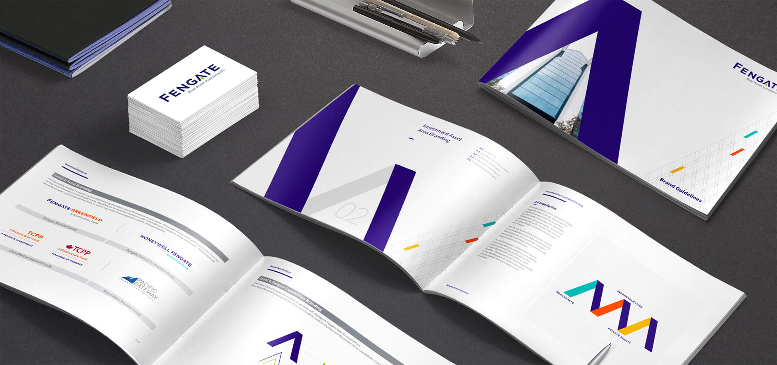
Fengate Capital is an alternative asset manager involved in infrastructure, commercial real estate, and private equity with a head office in Toronto, Canada. The company was facing significant brand challenges as their business grew from real estate to infrastructure and most recently to private equity; because the value proposition was losing focus and the brand architecture needed organization and structure.
Fengate asked Yield Branding to articulate their brand strategy and create a new identity and brand architecture that would allow them to continue to expand under one master brand structure. Based on the new brand strategy, Yield Branding proposed a new identity as the departure point for a new brand look and feel, website, and tool box of marketing materials.
Human catalyst
Investors want to get in on deals that others can’t find.
Our Solution
Following extensive research with internal and external stakeholders, Yield Branding developed a brand strategy and value proposition based on the notion that the firm was uniquely able to make deals in real assets that others couldn’t. The identity was designed to connote a sense of sophistication for a firm that wanted to compete against more established competitors, while also communicating solidness and stability; two important factors for a firm some still considered to be an upstart. The letter “A” was designed to be the focal point of the identity: a stylized upward arrow in three parts relating to the core elements of Fengate’s business model: sourcing, structuring and managing assets. The A is also an arch, suggesting buildings that are the essence of real assets. This design system became the basis for a full suite of marketing tools including the website, digital marketing, pitch decks and marketing collateral.


The Yield
Fengate continues to grow in the P3 space with expansion into Australia, Europe and Asia.
“Yield helped the team at Fengate identify the challenges that were facing our brand with a perspective that was honest, insightful and informed. Their team was collaborative and receptive, all the while keeping us on task and challenging us to dive deeper into Fengate’s identity and strategy. Their strategic planning process (GENESIS) allowed us to uncover insights about the Fengate brand that were leveraged into a sharper, more insightful value proposition. Yield’s visual identity platform provided a fresh brand image and design flexibility that allowed us to roll out a new look and feel into all of our marketing collateral.”
Courtney Ihnat
Marketing Manager
Fengate