

Metrolinx
Metrolinx, an agency of the Government of Ontario under the Metrolinx Act, 2006, was created to improve the coordination and integration of all modes of transportation in the Greater Toronto and Hamilton Area.
Industry
— Government
— Transportation
— Service provider
Branding to
— Become known
— Be better understood
Services
— Brand identity & visual systems
— Marketing collateral design
The Situation
Metrolinx was a new public organization set up by the Ontario Government to integrate and connect all public transportation modes in the Greater Toronto and Hamilton Area (GTHA). This organization would provide the public with a seamless connection experience while fostering greater cooperation between the different transportation mode providers. The core challenge was to develop a branding idea that could represent the connectivity between the different organizations and regions.
Human catalyst
People just want to get from A to B the easiest and fastest way possible.
Our Solution
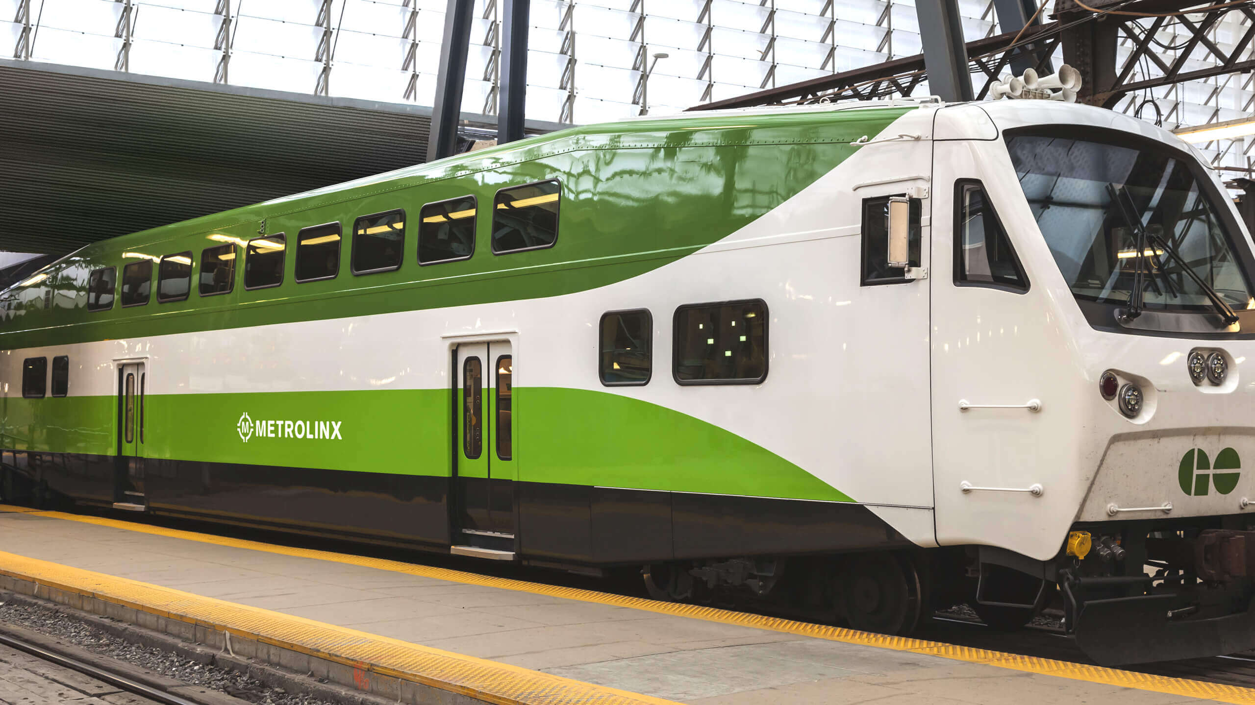
Yield Branding was tasked with developing a visual identity system that would define the new connectivity and integration that Metrolinx was going to bring forward. We chose to use the kelly green palette that had been adopted for the Presto Pass and had legacy value as the dominant colour for the GO network. We also wanted to communicate north, south, east, west connections anticipating that Metrolinx extends from Clarington to Caledon, Georgina to Hamilton. Lastly, we wanted the identity to have impact and be instantly recognizable whether it was on a bus, a train, LRT or a streetcar.
The Yield
The brand identity was used for nine years until 2018 while Metrolinx grew to deliver 40% more passengers and develop $32 billion in transportation initiatives.