

150Alliance was an organization commissioned by the Federal Government to promote participation and connect groups interested in supporting Canada150, the celebration of the country’s sesquicentennial.
In the lead up to the 150th anniversary of Canada in 2017, Community Foundations Canada was asked to establish a brand and the programming for a body that would inspire, connect, and promote collaboration and shared experiences among the hundreds of companies and organizations wanting to celebrate Canada’s sesquicentennial. Yield was asked to create a brand strategy and brand platform for the 150Alliance.

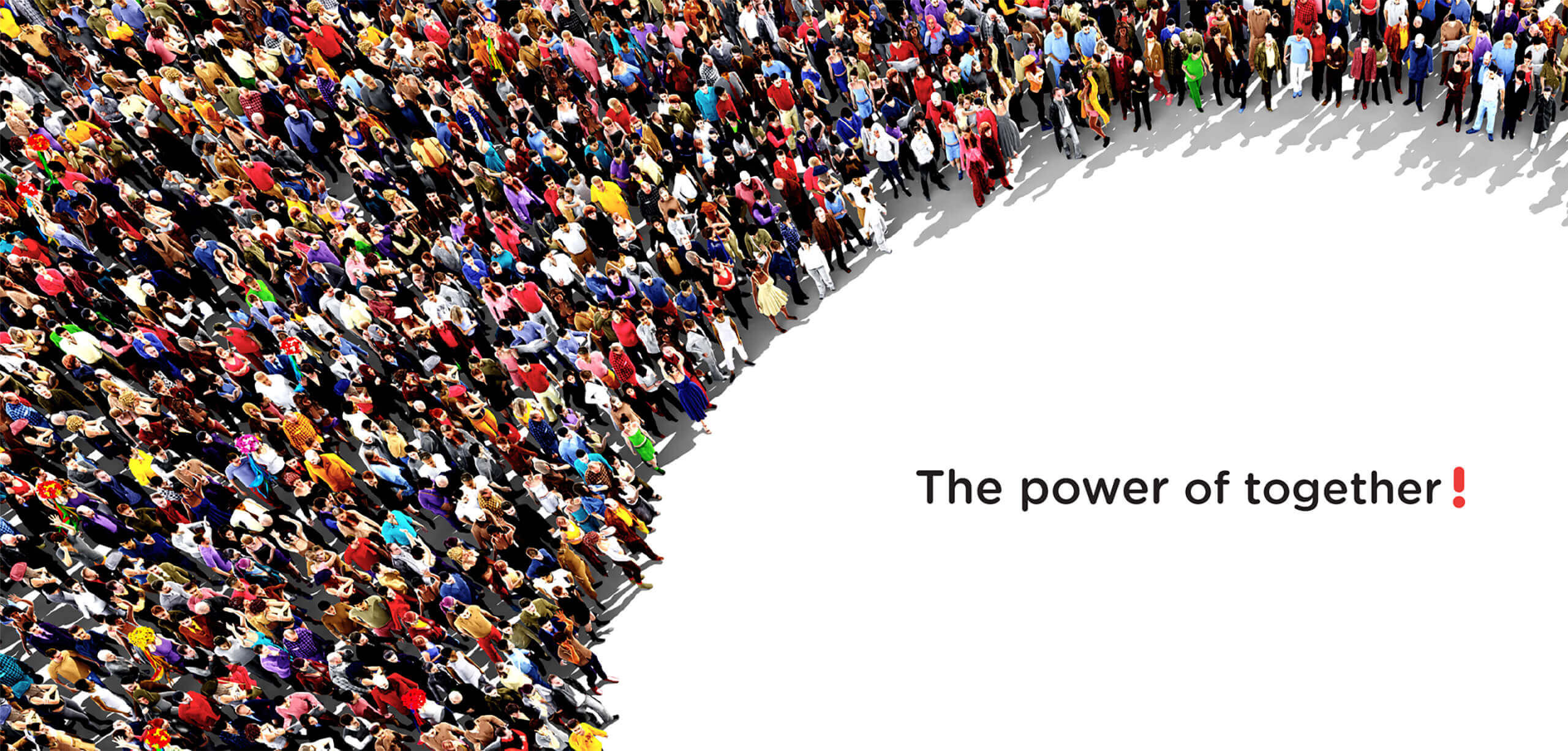
Organizations want to show their pride in Canada’s 150th but are not sure what impact they can have on their own.
As the first step in the solution, Yield attended a national 150Alliance conference and interviewed delegates to better understand what their hopes and fears were for their participation in the sesquicentennial. This input was the basis for a brand strategy centred on the promise that 150Alliance is: the catalyst that will bring out the best in Canada – giving your mandate wings, and making our country better for all.
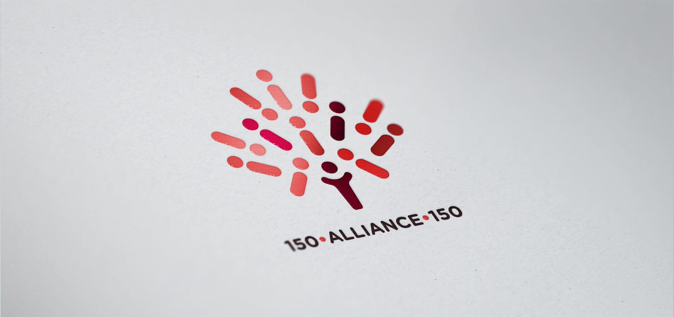
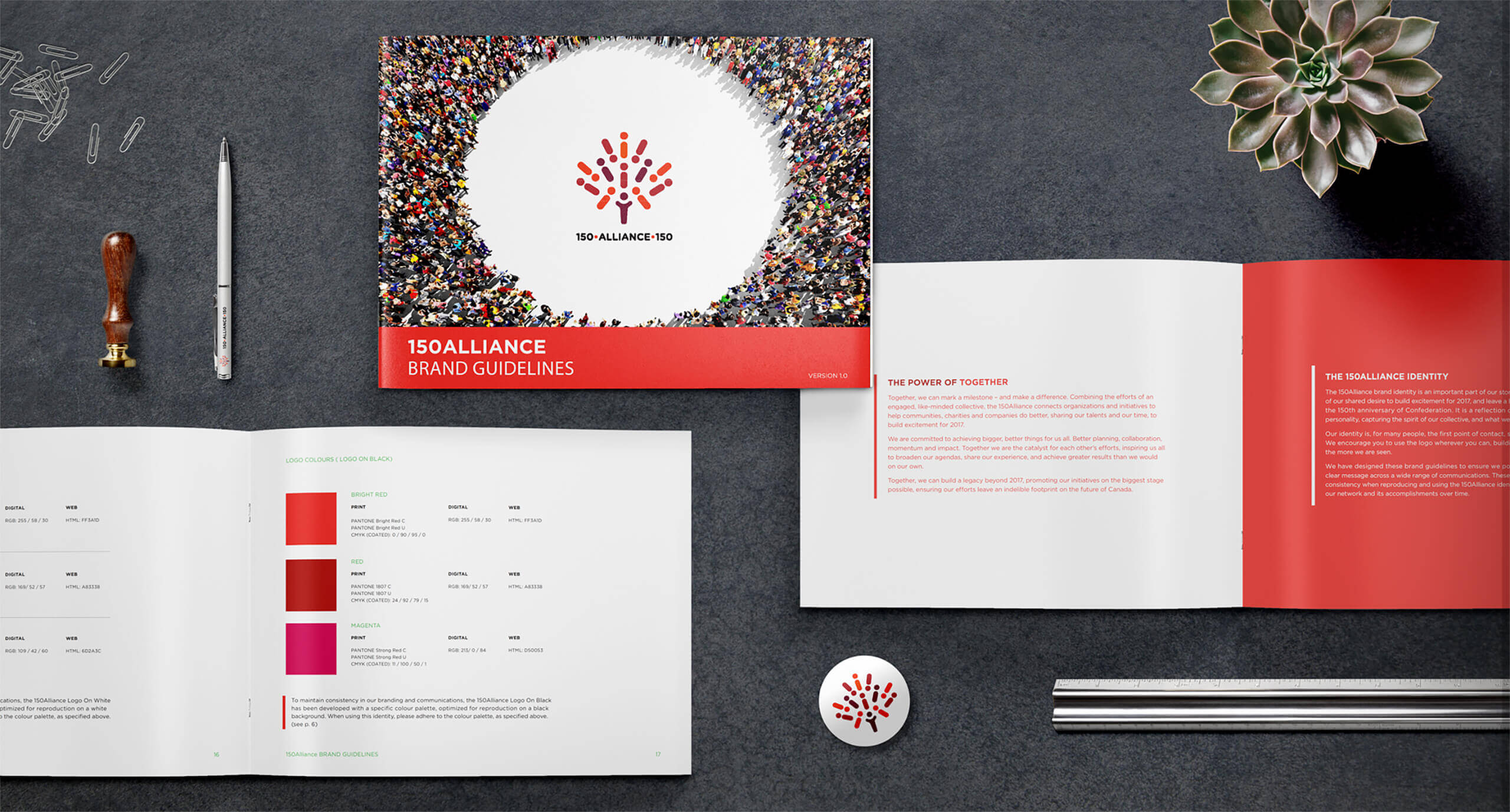
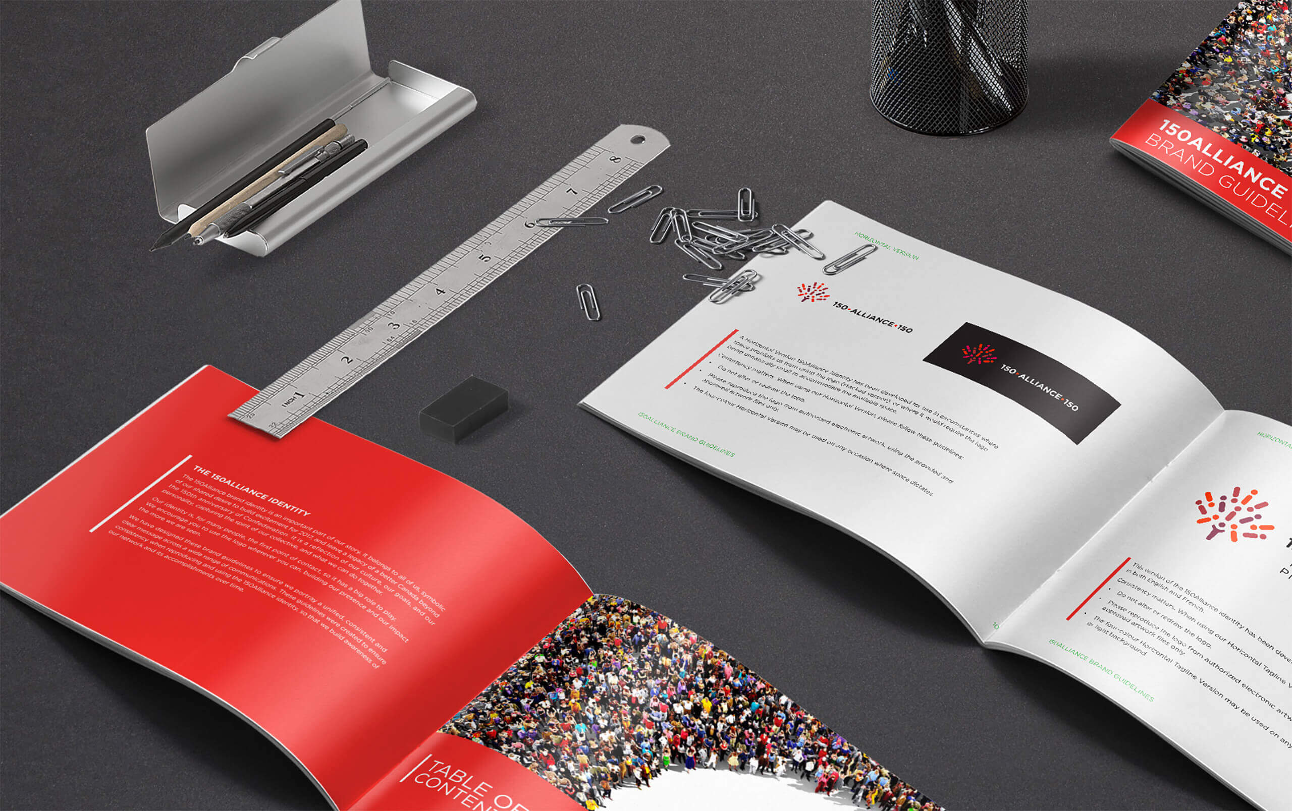
The first iteration of the strategy was a brand logo identity rooted in the tagline: The Power of Together. The logo was a symbol made of 13 shapes, each one representing a province or territory coming together and collaborating to form a maple leaf, the symbol of Canada.
This graphic symbol became the basis for a visual identity system that drove creation of a website and digital branding campaign to promote the new organization.

With the new branding and marketing tools, 150Alliance was able to galvanize organizations and support the 150th and achieve:
• Over 158,000 volunteers contributed over 5.3 million hours.
• 174 projects reported partnerships with financial contributions totalling over $60M.
• Community Foundations of Canada recipients leveraged an additional $44.4M in cash and in-kind.
• 70% of Canadians participated in a Canada 150 event (includes volunteering, attending or watching on TV or the internet).


